
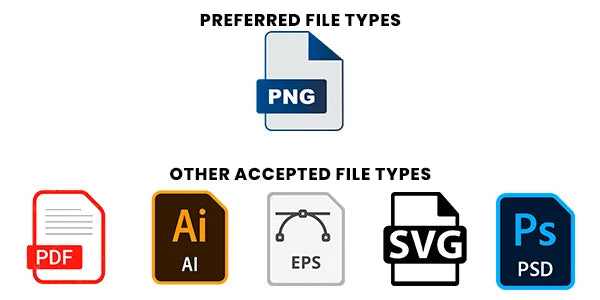
Send PNG (RGB) when you can
PNG in RGB is best for our workflow. We also accept PDF, AI, EPS, SVG, and PSD when prepared correctly. JPG has no transparency, so it is the weakest choice.
Files are printed as submitted. Two minutes here saves a reprint later.
If your file meets this list, it sails through review:
Flattened and consistent. Also accepted when prepared correctly: PDF, AI, EPS, SVG, PSD. JPG is less ideal: it never has transparency.
Export at the exact print size you are ordering. Low resolution is the number one file problem we catch.
If your file has a background, it prints. JPG backgrounds always print unless removed before export.
Leave about 0.25 inches between designs and some space near the edges. Group designs by size when possible.
Transfers print ready to press. Only mirror if you intentionally want a mirrored result.
Tiny text, very thin lines, and soft transparencies print unreliably. Bolder detail prints better.
Your file prints as submitted. We do a basic review, but we do not redesign artwork. Confirm spelling, size, background, and spacing before ordering. We also reserve the right to refuse files with profanity, hate, or offensive content.
Eleven quick checks, each shown side by side. Match your file to the correct example before you upload.
PNG in RGB is best for our workflow. We also accept PDF, AI, EPS, SVG, and PSD when prepared correctly. JPG has no transparency, so it is the weakest choice.
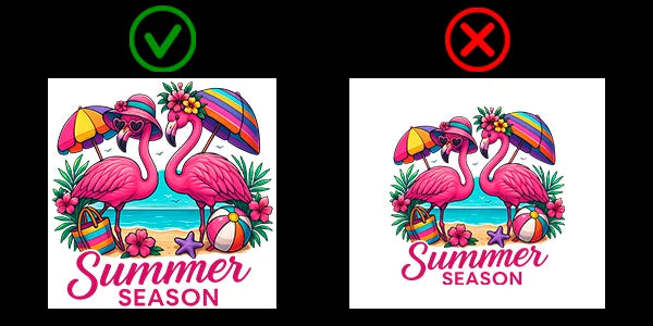
Set your file to the exact print size you are ordering. Low resolution is the number one problem we catch, and it cannot be fixed after upload.
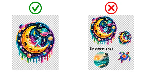
Whatever sits behind your art prints too. Use a transparent PNG for a clean edge. This is the single most common upload mistake.
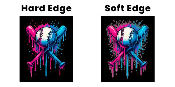
Soft fades and feathered edges rarely match what you see on screen. Crisp, defined edges hold up best once pressed on fabric.
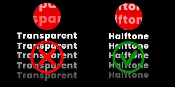
DTF prints over a white underbase, so partial transparency behaves unpredictably. For a gradient look, use a halftone dot pattern instead.
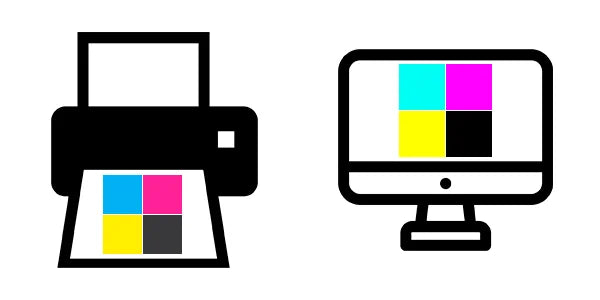
Our process is tuned for RGB. Your screen is only a preview: monitors vary, and print color is created a different way.
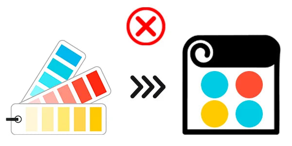
We do not match Pantone or spot colors, and we do not guarantee identical color between separate runs. If exact color is critical, press a $10 color chart first.
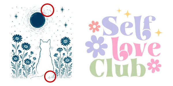
Hairline strokes and tiny text can drop out or blur. Thicken thin outlines and use readable font sizes so fine detail survives the press.
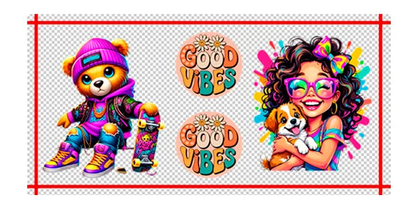
Space each design about a quarter inch apart and keep some room near the edges. Group designs by size when you can to save film.
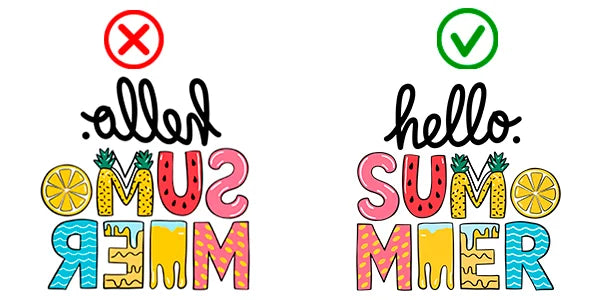
Transfers print ready to press, facing the right way. Only flip your file if you genuinely want a mirrored result.
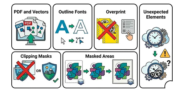
Outline your fonts, turn off overprint, avoid clipping masks, and flatten masked areas. Match the artboard to your design size.
Multiple designs arrive on one gang sheet and you trim them apart as needed. That is also why the spacing between designs matters.
No notes or instructions inside the file, no hidden layers, no backup versions. For gang sheets, several designs in one file are fine with proper spacing.
PNG in RGB at 300 DPI, sized to print, with transparency if needed.
Yes, if you want a clean cutout. If you keep a background, it prints.
About 0.25 inches between designs.
Screens vary and many are not calibrated. Print and screen color behave differently, so screen color is a preview, not a guarantee.
No. If color is critical, we recommend a small test order or a $10 color chart pressed on your own fabric first.
Every order gets a free file check. If we spot a problem, we contact you before printing.